Improved Emergency Communications (Service design)
Problem
Overly complex alert configuration screens led managers to set poor notification thresholds. Travelers got flooded with low-priority alerts and started turning messages off, a serious risk if a real emergency hit.
Solution
I mapped the full traveler journey across multiple crisis scenarios to establish a rational communication baseline. Manager screens were redesigned with simpler controls and plain-language settings. Mockups were validated with international Security teams, and the redesign shipped as a major feature in the core product release.
Tools
Figma, Leonardo AI, Stable Diffusion (for storyboarding)
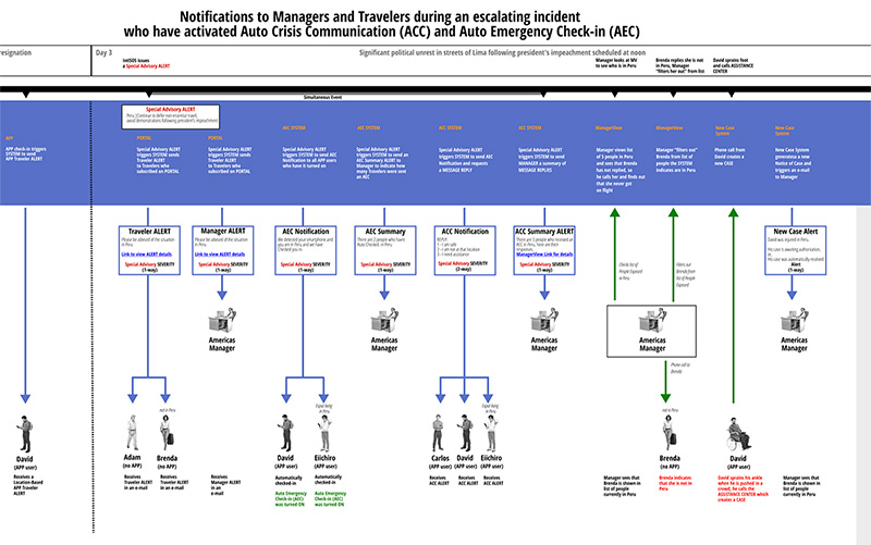
Service Design for all phases of a critical event
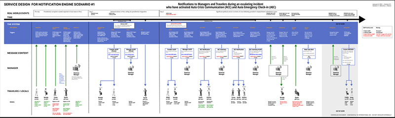
Detail showing system (in blue) and front stage activities
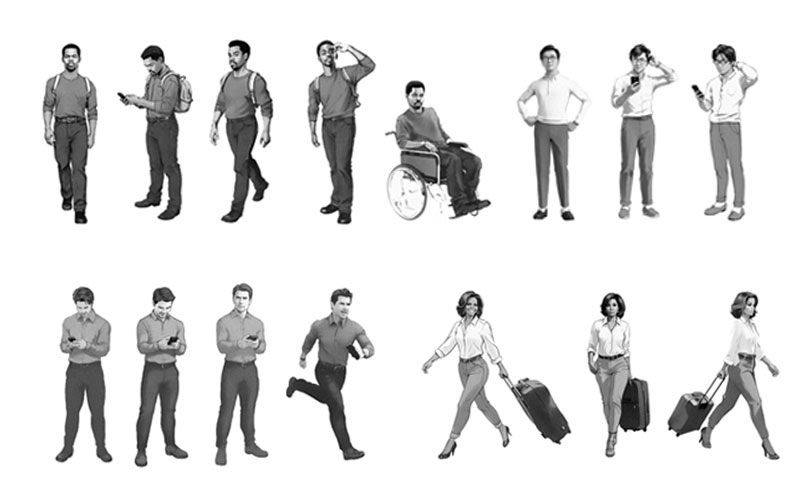
AI-generated personas to storyboard key events in multiple journeys
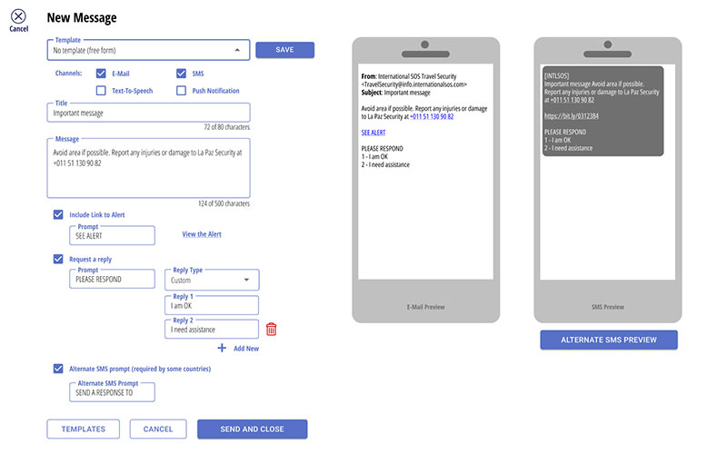
Initial mockup of new message configuration screen
TOP