Custom Overlay Mapping (Feature concept)
Problem
Customers needed richer map views, combining people, assets, and environmental data like wind and weather, to assess risks in real time. The solution had to be intuitive and built on the existing Mapbox platform.
Solution
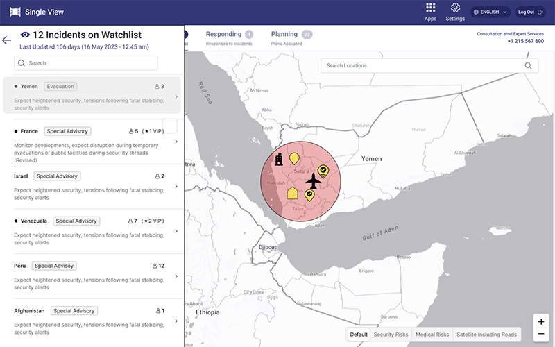
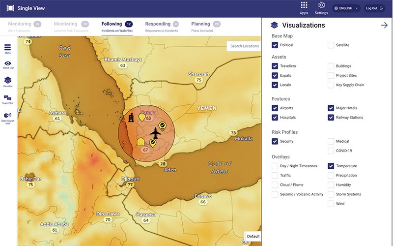
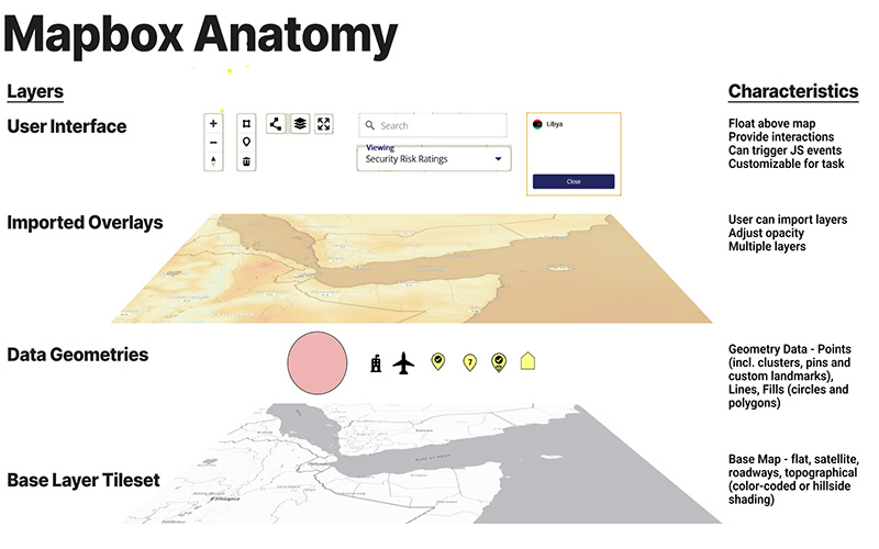
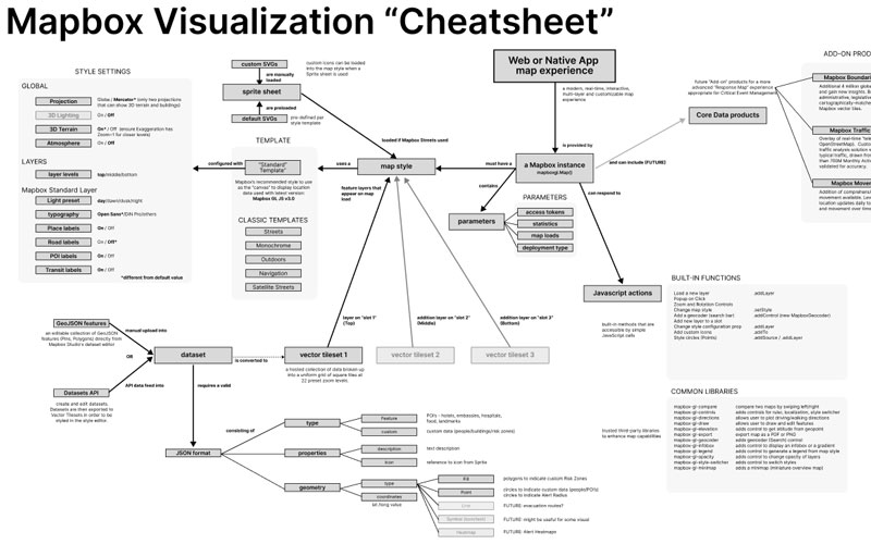
I explored Mapbox's extension APIs and built multiple prototypes with realistic overlays and in-canvas controls. User testing surfaced an unplanned need: a watchlist feature for bookmarking high-risk locations. Delivered final mockups plus map anatomy and API cheatsheet diagrams to help developers implement the new toolkit.
Tools
Figma, Adobe Animate, Photoshop, Mapbox
New watchlist feature on screen and enhanced map
Wind overlay on new configurable map
Breakdown of Mapbox layers for developers
Mapbox API cheatsheet for developers
TOP