Emergency Blood Testing (Formative testing)
Problem
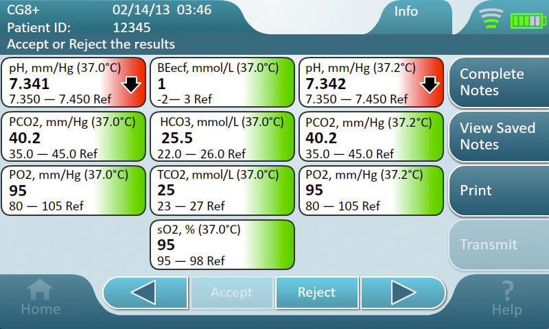
How many blood chemistry results could fit on an 800x480 screen and still be readable under clinical conditions? Which results mattered most, and how should out-of-range values be highlighted?
Solution
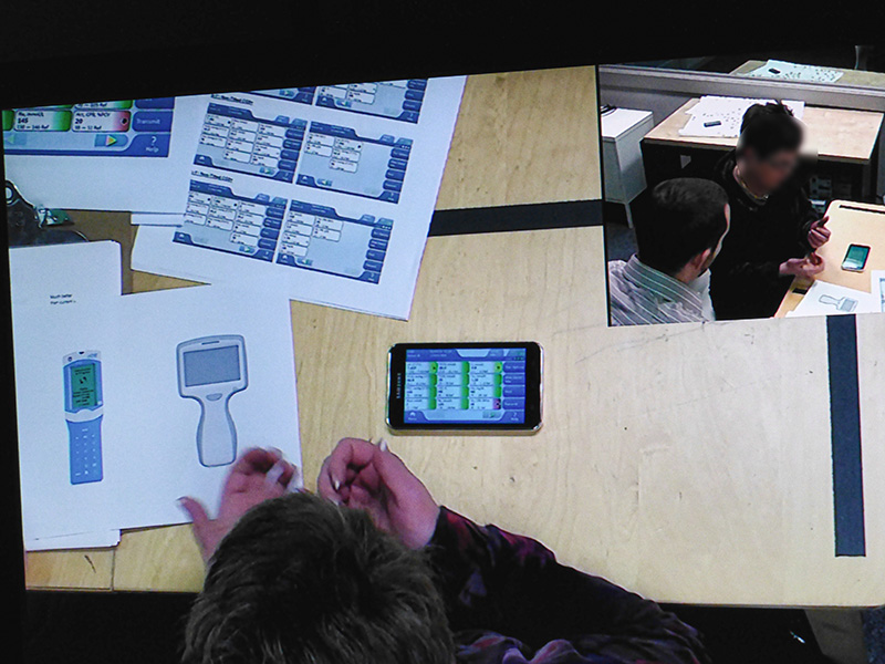
Early studies used paper prototypes in controlled settings. Later rounds ran on Android phones matching the device resolution, with clickable drill-down screens. After several rounds, 12 results proved the right cognitive load. The findings established the visual language, color palette, and interaction patterns used in the final product.
Tools
Photoshop, Adobe Flash
Early prototype of test result screen for study
Validation testing with nurses
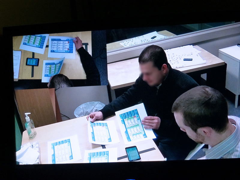
Comparison with alternative designs
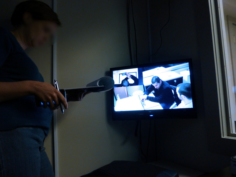
Researcher noting pain points and unexpected insights
TOP